top of page


KAUS Insurance
Research | UX & UI | Responsive Web
Project Background
KAUS is a (hypothetical) insurance company who has been in the business for over 30 years. Having over 350 separate offerings, instead of fully customized options, they sell prepared packages to keep their rates lower than their competitors. In this project, KAUS' e-commerce website was redesigned to reflect its attention to attract younger individuals, help customers quickly understand which service suits them the best, and essentially, to make the site look clean, fresh, and user-friendly.
My Responsibilities
Working as the project manager of this project, my tasks involved conducting user research, map out the user journey, identity design, UX design, and prototyping a responsive web UI. With the help of my mentor and other fellow designers, I was able to accomplish the project in one month.
Secondary Research & Persona Development
A critical component of our digital marketing analysis and reporting is identifying the target customer persona through Market research and 1-on-1 user interviews. This allows us to fine-tune content that speaks directly to audience segments with different priorities, mindsets, and needs — no matter what stage of the buying cycle they’re in. During the 1-on-1 user interviews, I attempted to interview with potential customers living in Melbourne (metro area), Australia v.s people living in New York and New Jersey (metro area), America; hoping that I can get as many data as possible. Although all audiences are from English-speaking countries, there are still differences in the use of words (example: post v.s zipcode) as well as shopping habits and experience. To provide the audience with the best shopping experience, I learned that it is important to refine the language and content for audiences from a specific region. In the future, when designing products for local customers, I will likely be focusing on interviewing the local audience.
Task Flow & User Flow
To map out the user journey for our potential buyers, the task flow was created to show how users could travel through the site, while the user flow takes into account through user research — most users enter the site through a referral link. Thus, in the user flow, the user already knows the type of insurance he/she wishes to buy and would go through the quoting processing right after entering the site.


Wireframe
The wireframe was carefully created based on the Task Flow.

KAUS wireframes homepage

KAUS wireframes quote page 1

KAUS wireframes quote result

KAUS wireframes homepage
Design Pattern
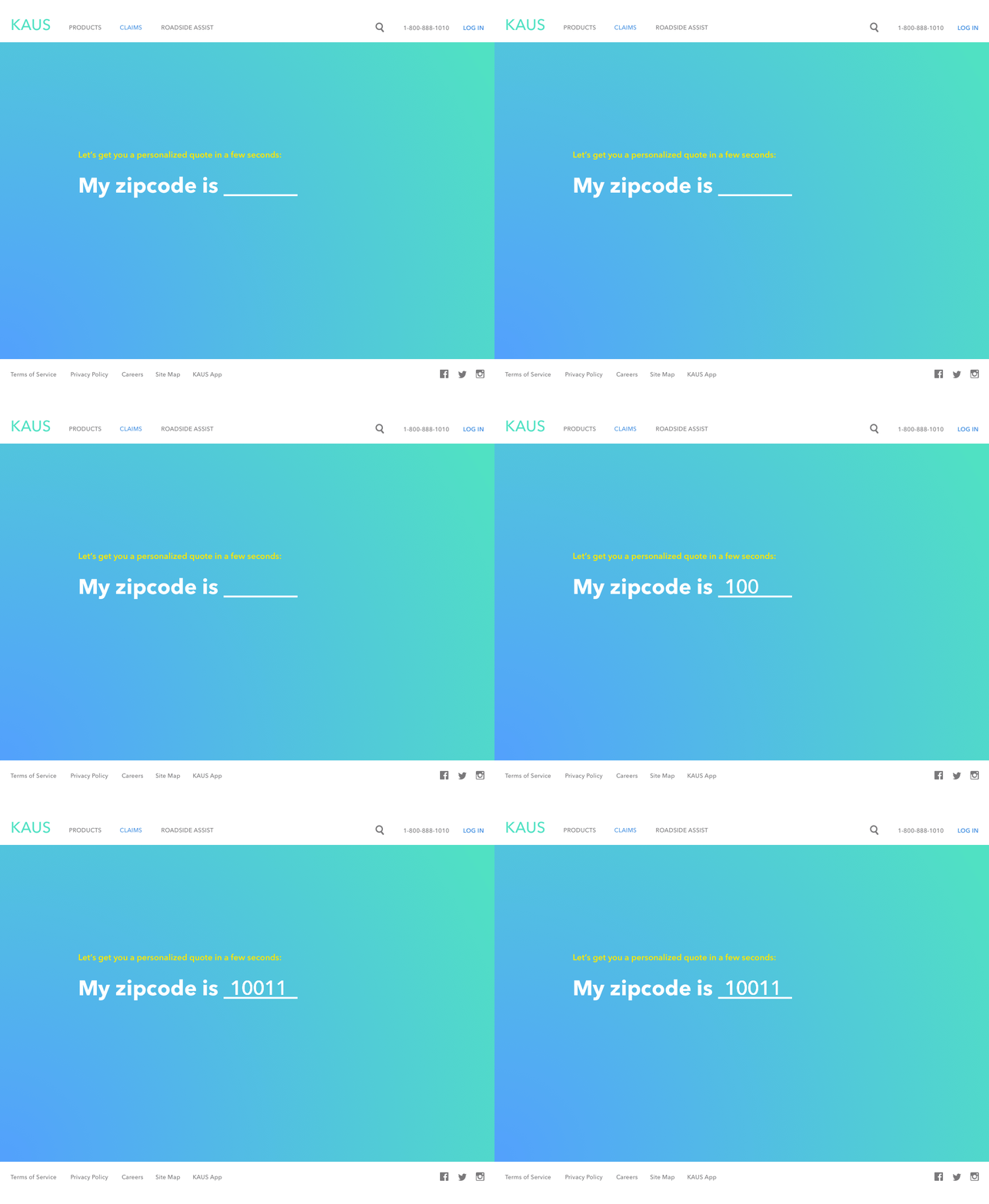
To provide KAUS customers an effortless and enjoyable buying experience. The "Natural Language Form-filling" pattern was used to navigate customers throughout the quoting process.

Usability Test & Findings
There were a total of 4 participants. The task was for them to get a quick predesigned insurance quote, and to test the overall quality of the navigation and flow. The test was done individually on their desktops. I sat next to them to observe the progress and asked questions when finished. Below is the summary of feedback:
-
0/4 participants had any issue completing the task.
-
4/4 participants think the UI is relatively simple and the flow is easy to follow.
-
Most of the feedbacks were specific to the look and feel of the website, like color, image, font size, and wordings.
-
2/4 participants mentioned that the content of the site needs to improve and add more details.
-
1/4 participants suggested adding step number throughout the quick quote process.

The Result
The result is an elegantly designed Responsive website that not only accentuates KAUS’ attention to quality but also provides an optimal viewing experience across a wide range of devices — whether the customer is on a smartphone or on a 1280 x 1024 screen. It allows easy reading and navigation without the drudgery of resizing, panning, and scrolling. Creating a simple yet delightful shopping experience.
bottom of page